Personal venture · macOS

Booker, a creative reference library

Years of scattered browser bookmarks turned into one visual, searchable home. Designed like a Mac app should be, and built solo with AI as the engineering pair.

Role
Product designer · design engineer
Timeline
2026
Platform
Native macOS
Company
Personal venture

0+

bookmarks, one home

pulled from every browser into a single visual library

0

sources unified

Chrome, Arc, Firefox, Safari, and HTML exports, syncing live

0%

on-device

no account, no telemetry, no cloud; export is always free

0fps

through thousands of cards

the board is virtualized, so a huge library still glides

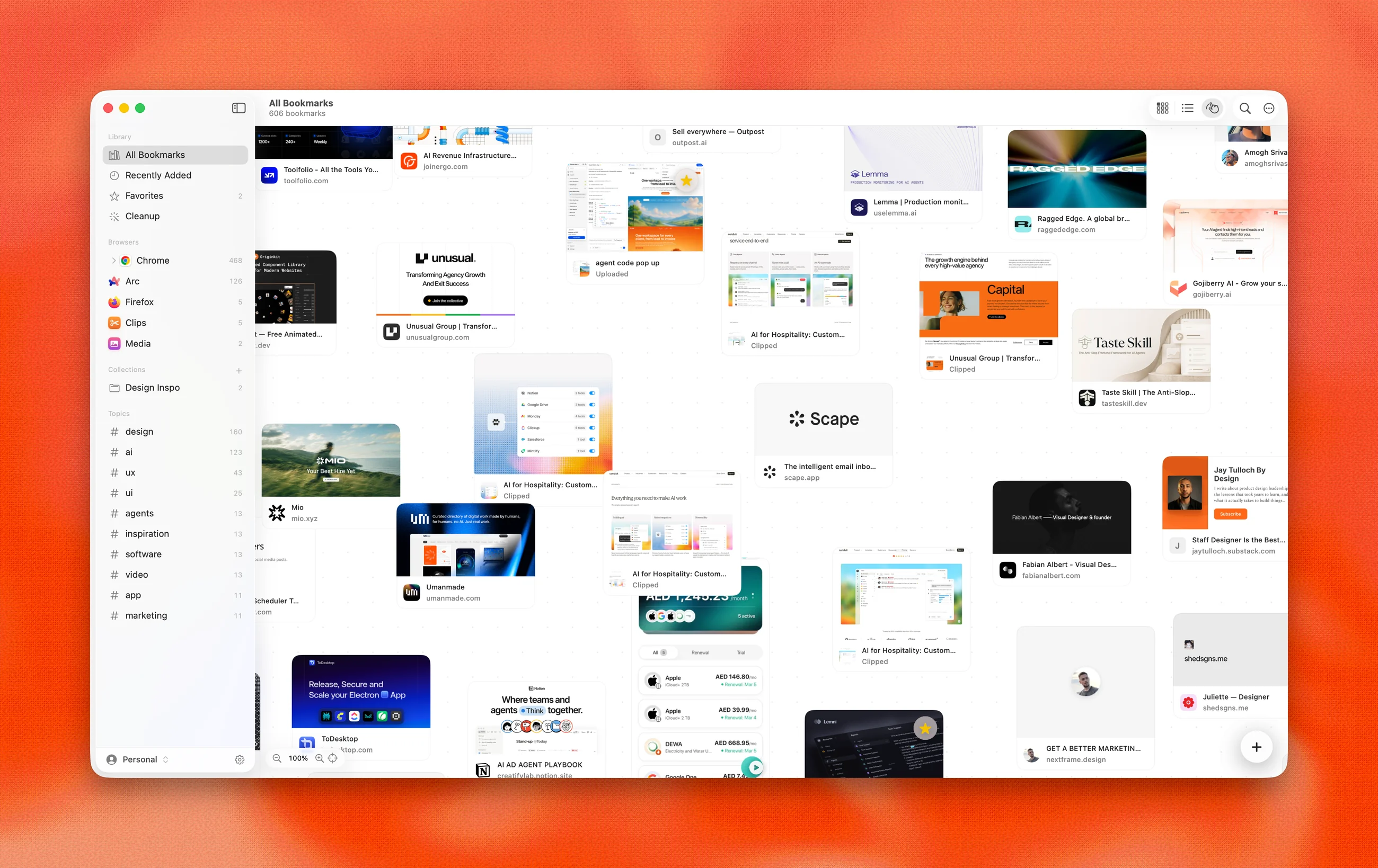
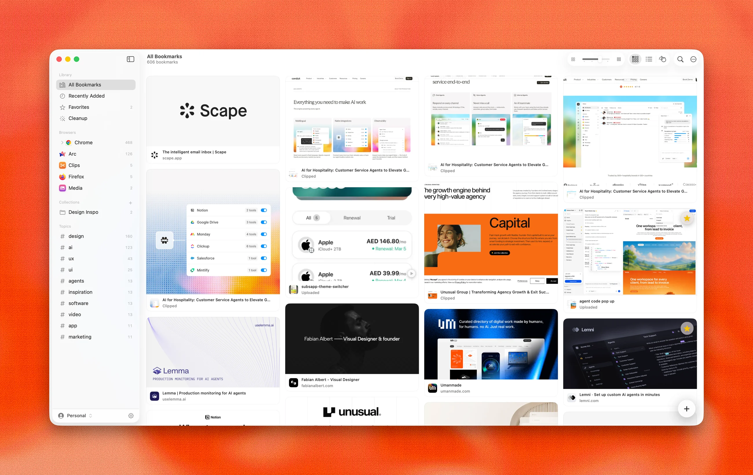
Booker library: an image-first masonry board of bookmark cards on macOS

The library. Every save becomes a visual card: og:image previews, HD favicons, hover actions.

Bookmarks became lost treasure

It is 2026 and a new browser ships every quarter. Chrome, Arc, Dia, whatever comes next: each one arrives with its own bookmark silo, and nobody cares what happens to the saves left behind. Saving got easier every year. Finding never did.

So bookmarks became lost treasure. We hold hundreds of them, collected over years across Chrome, Arc, Firefox, and Safari, and we never find the one we need. The tools that tried to fix this are either web silos that hold your data hostage (Pocket’s shutdown proved the risk) or utilitarian list managers with no visual sense.

Designers collect visually. A reference library should look like one.
A replacement, not another silo

Booker is a full bookmark replacement: every browser imports read-only into a local SQLite library, presented as an image-first board, made findable with on-device AI. Bookmark a page in Chrome and it lands in Booker seconds later, keyed by the browser’s stable IDs so re-imports never duplicate.

And it is local-first on principle. No account, no telemetry, no cloud. The library lives on your Mac, and export is always free.

Designed by hand, built with AI

I am a product designer, not a career systems engineer. Booker exists because AI finally collapsed the distance between a design decision and a shipped build: I design every screen, state, and interaction, then pair with Claude and Codex to turn that intent into production Swift.

The taste calls stayed human. What deserves glass and what does not, how dense the board should feel, what an empty state says, when the app should stay quiet: that judgment never left the design seat. AI wrote a lot of the code; the product opinions are mine.

A visual library

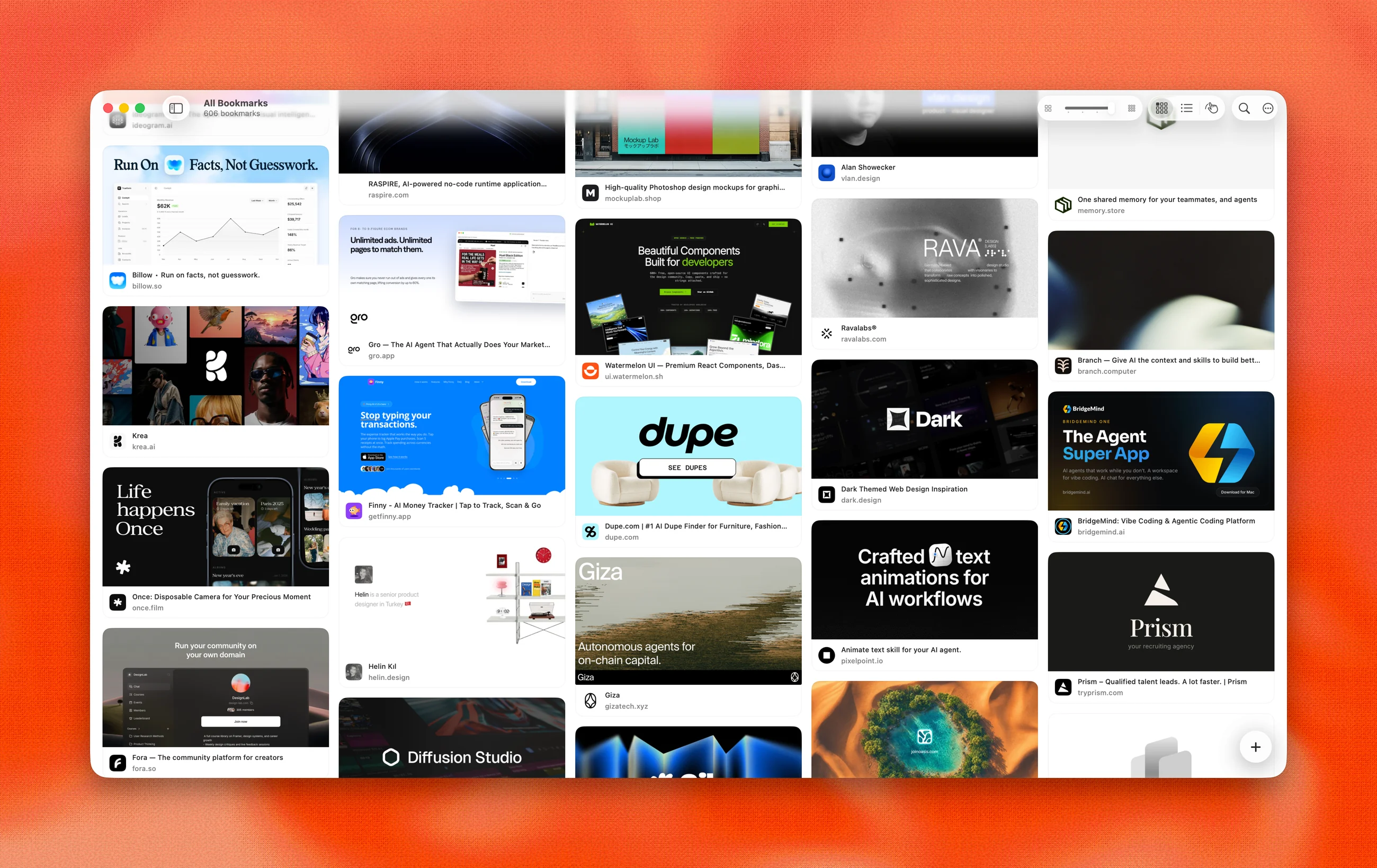
Booker masonry board in light mode with rich bookmark cards

A masonry board with adjustable 2 to 5 column density, list view, and hover-revealed actions. Virtualized: thousands of items scroll at 60fps with flat memory.

How it works

01

Universal import, live sync

Reads Chrome (all profiles), Arc, Firefox, Safari, and Netscape HTML exports. File watchers sync continuously: save in any browser and a toast confirms it landed.

02

⌘K command search

A Raycast-class palette over a frosted backdrop: natural language ("design videos from chrome"), semantic matching by meaning, scope chips, and every app command, fully keyboard-driven.

03

On-device intelligence

Apple’s Foundation Models and Vision frameworks, entirely local: automatic topic tags, one-line summaries, semantic and visual search ("dark moody UI" finds images by what they look like), and a Discover rail of similar sites.

04

Library hygiene

Cleanup scans find dead links, duplicates, and never-visited saves. Profiles separate work and personal; collections organize with AI-suggested members.

One library, three ways to see it

Different work wants different densities: a loose canvas for moodboarding, a dense grid for hunting, and both appearances from day one.

Open canvas
01Open canvasan infinite drag canvas, the way moodboards actually get made
Dense grid
02Dense gridfive-column density for scanning a big library fast
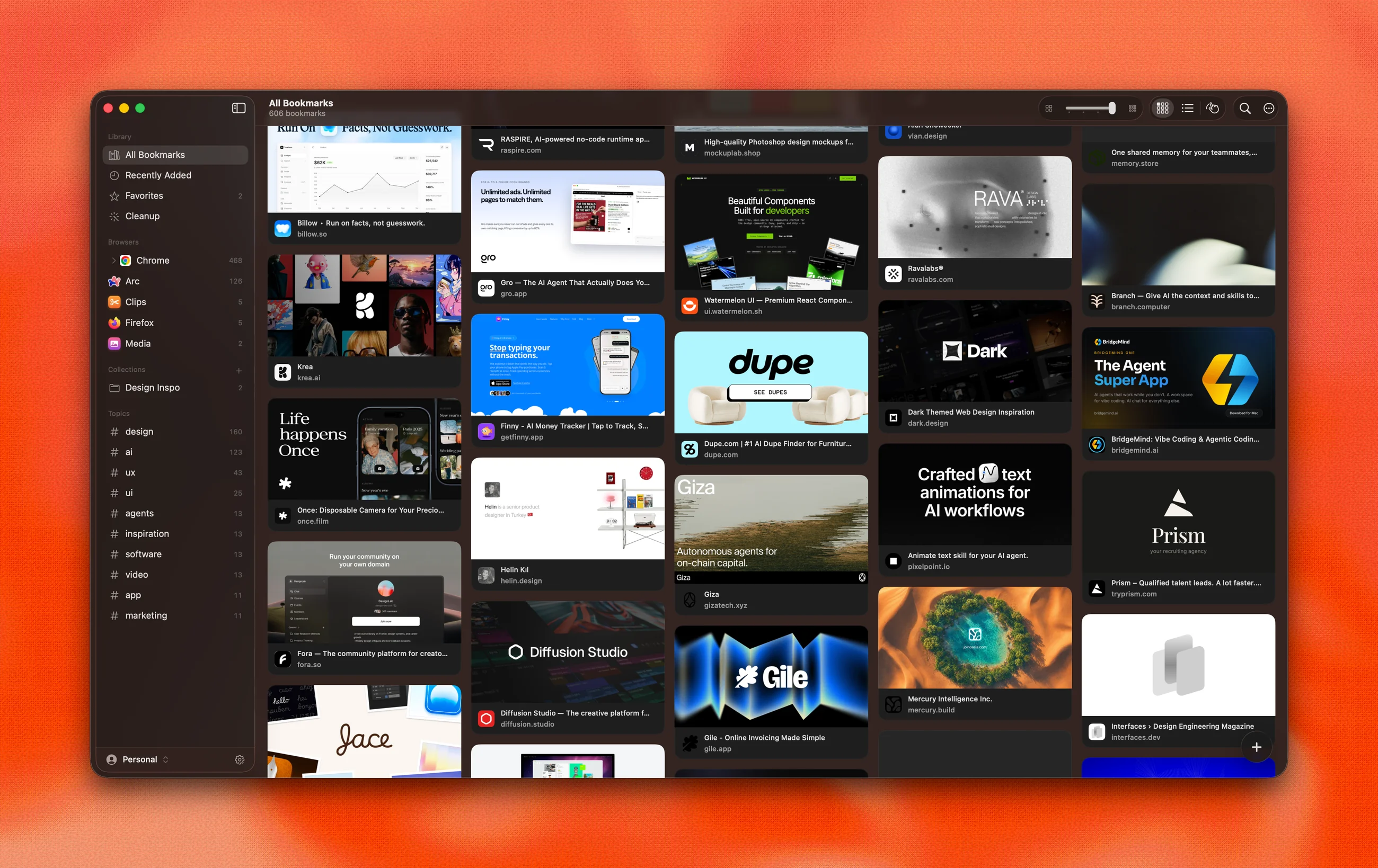
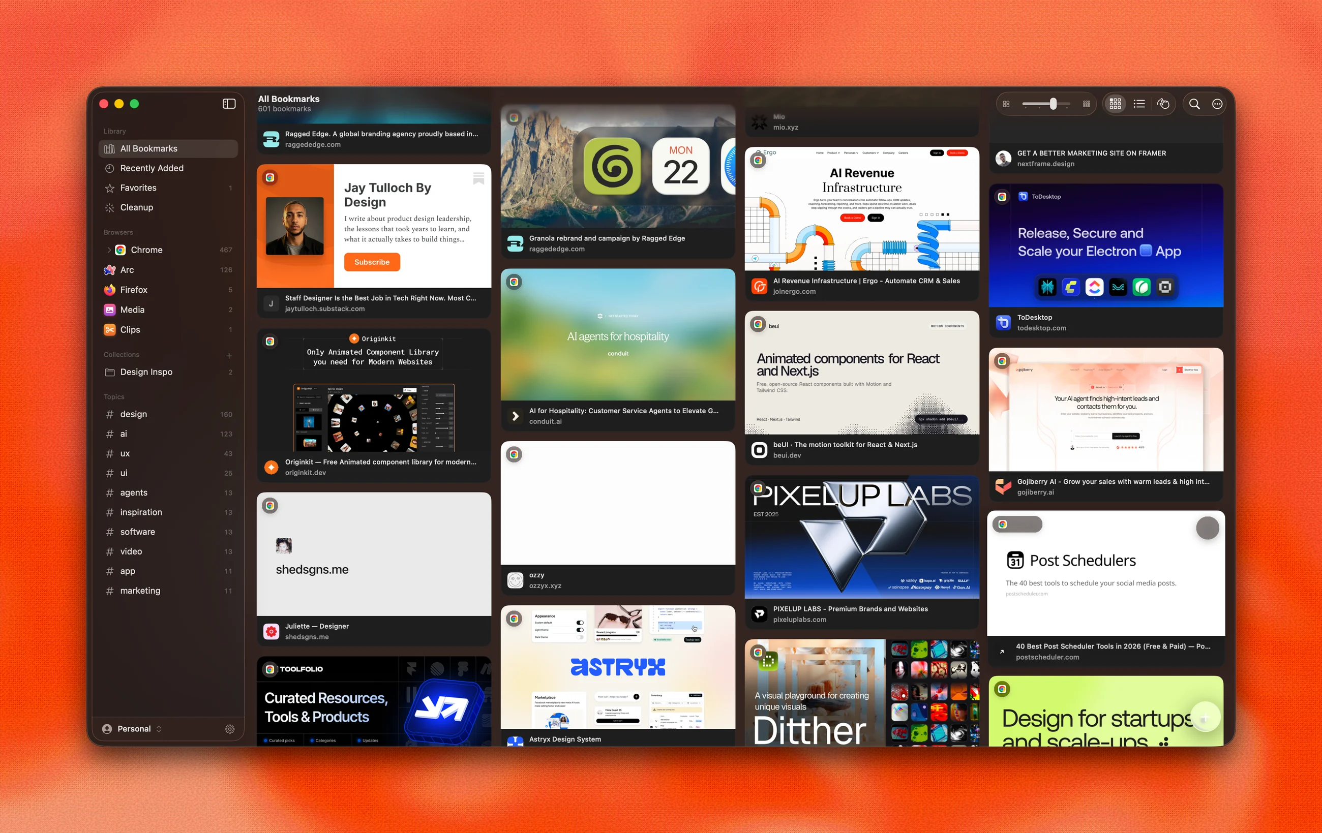
Dark appearance
03Dark appearanceevery screen ships in light and dark, verified by a snapshot harness

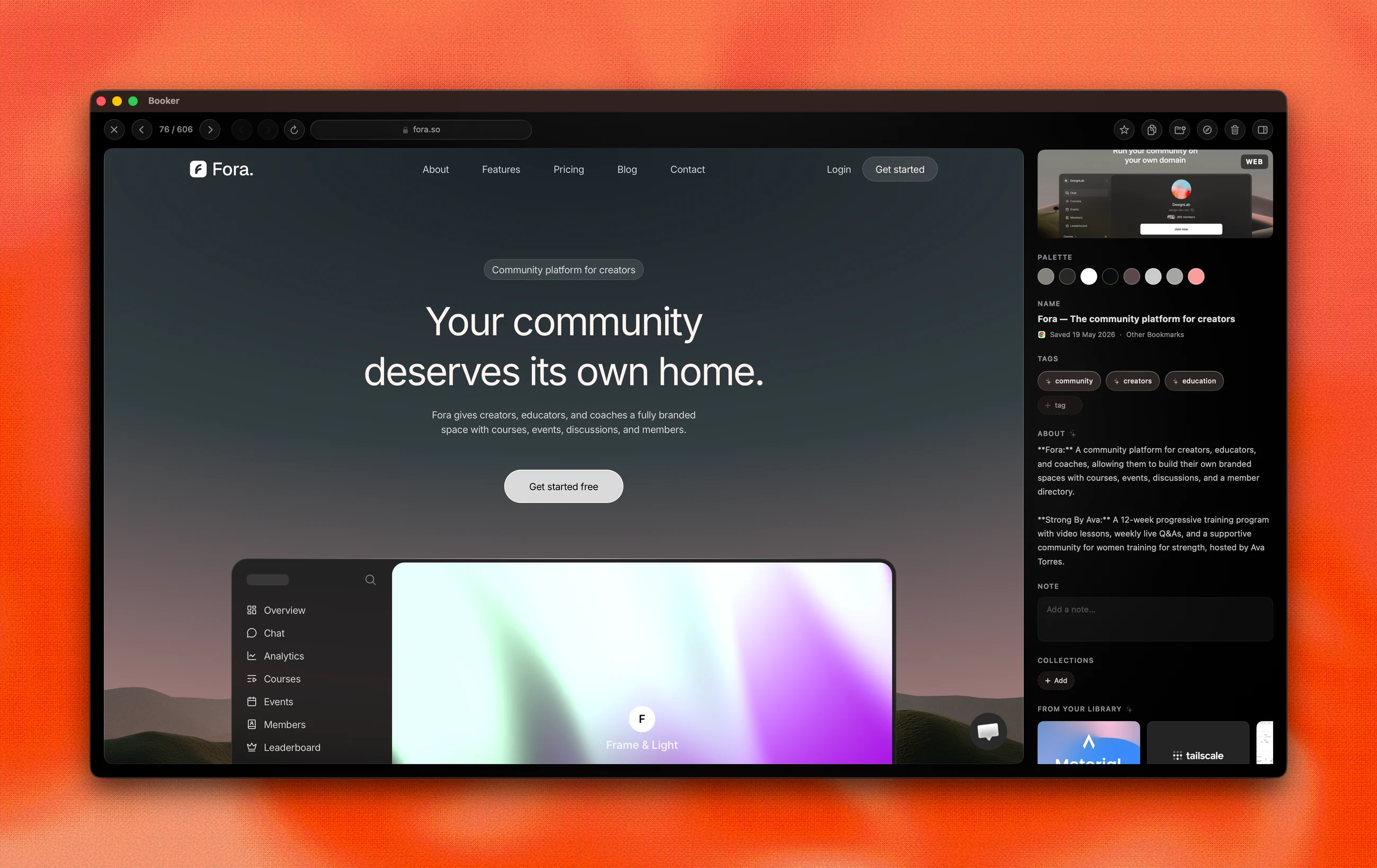
A detail page, not a popup

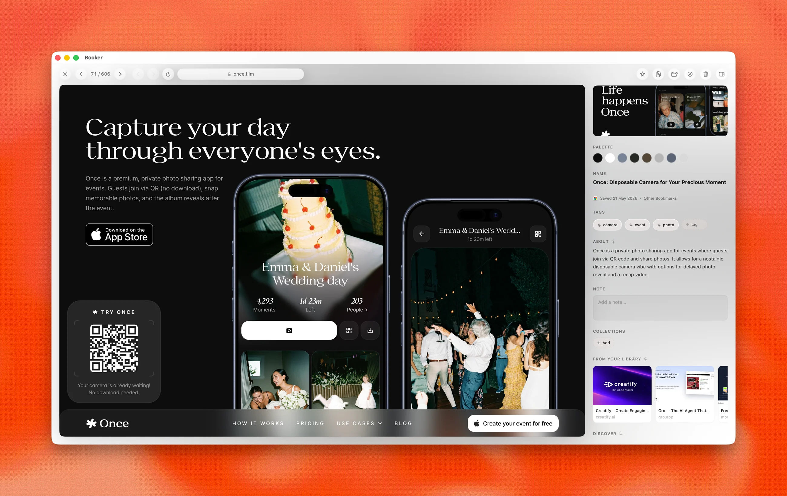
Booker detail page with built-in browser, extracted color palette, and AI tags

Clicking a card opens a full page: the site loads in a built-in browser with a web clipper (right-click any image to save it), media renders at full resolution with an extracted palette, and the ambient background drifts through the item’s own colors.

Booker detail page in dark mode

The same page in dark. AI wrote the one-line summary; the palette, tags, and similar items came from on-device models.

Fast enough to disappear

KPIBeforeAfterChange
Memory footprint628 MB136 MB−78%
Idle CPUconstant churn0%flat

Performance is a design property: a reference tool should feel like part of the OS, not a tab. When it felt heavy I kept auditing until it disappeared, with board virtualization, tiered image caches, parallel decoding, and web-process teardown.

Built like a Mac app

Design decisions

  • Liquid Glass reserved for singular chrome, so scrolling stays cheap
  • Every screen designed in light and dark from day one
  • Detail pages get ambience: backgrounds drift through the item’s own palette
  • Tooltips, menus, and toasts redrawn as custom glass so nothing breaks the material

The AI-paired build

  • Swift 6, SwiftUI and AppKit, written in pair with Claude and Codex
  • GRDB/SQLite with FTS5 · WebKit · Vision · Foundation Models
  • 145 automated tests keep the AI honest; parsers built test-first on real browser data
  • A snapshot harness renders every surface in both appearances before a change ships

Added “Scape” from Chrome.

The sync toast, seconds after you save in any browser